

Backoffice UX is where online casinos either quietly scale or quietly bleed. It is the screen your ops team lives in for KYC reviews, payout approvals, fraud triage, bonus enforcement, affiliate settlements, and audit evidence. When it is clunky, you pay for it in slower queues, higher error rates, more support tickets, and more “hero work” that collapses the moment volume spikes.
Design it well and the backoffice becomes a compounding advantage: faster decisions, fewer disputes, cleaner compliance, and a calmer operation that can launch markets and campaigns without breaking.
Why casino backoffice UX is a growth lever (not an internal nice-to-have)
Most operators invest heavily in player UX because it is directly tied to conversion. But once you have any meaningful volume, operational UX drives margin just as much.
Here is the pattern every casino eventually sees:
- More payment methods and more geos increase edge cases (async bank payments, crypto confirmations, chargeback evidence, FX drift).
- Compliance gets stricter, and audits move from periodic to “always-on.”
- Fraud becomes faster and more automated, which forces your team to make more decisions per hour.
In that world, backoffice UX is not about “pretty dashboards.” It is about decision throughput with correctness.
A strong admin experience reduces:
- Time to resolve KYC and withdrawal reviews
- Cost per investigation (fraud, bonus abuse, affiliate quality)
- Rework and reversals (mistakes that require manual fixes)
- Support volume driven by unclear statuses (especially withdrawals)
If you want a concrete example of how operational UX ties to costs, see Spinlab’s playbook on reducing withdrawal support tickets by productizing status and eligibility instead of pushing everything into manual workflows.
Start with real backoffice users (and the “jobs” they actually do)
Casino backoffice screens are often designed around modules (“Payments,” “KYC,” “Bonuses”), not around the way people work under pressure. The result is tab-hopping, copy-paste, and Slack-driven decisioning.
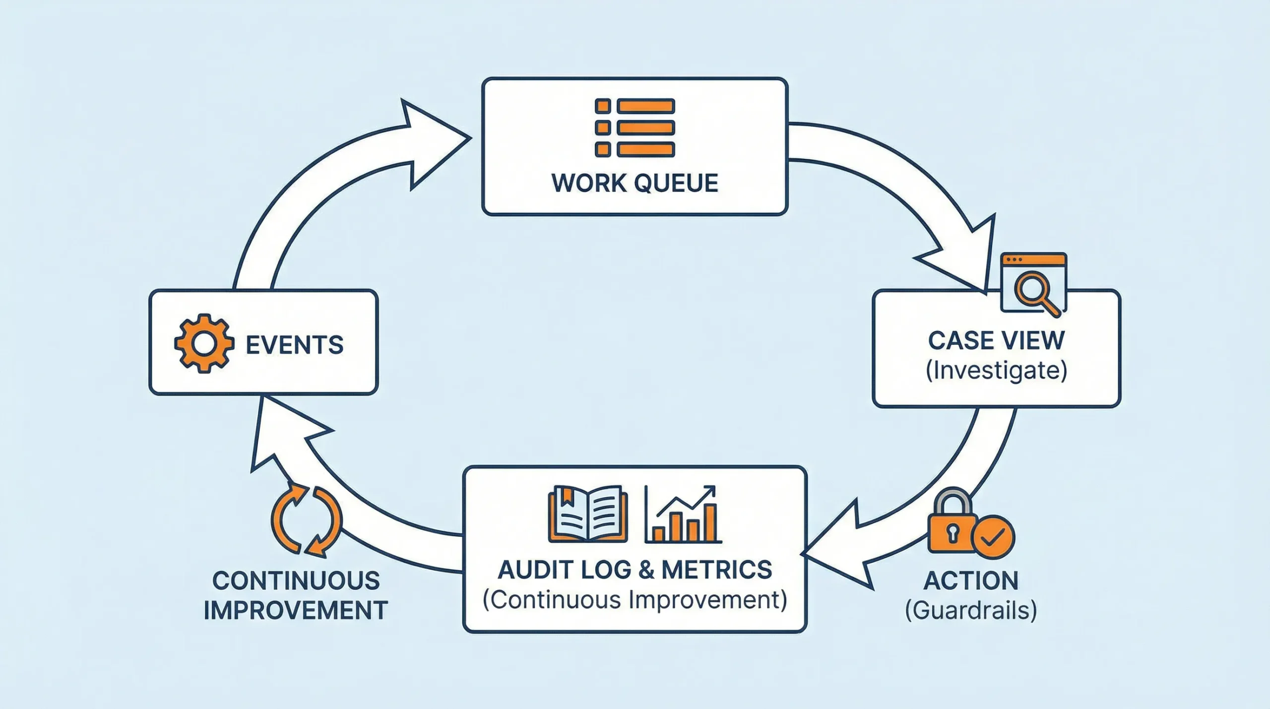
A better approach is to design around roles + queues + exceptions.
| Role | What “good day” means | What breaks them | UX design priority |
|---|---|---|---|
| KYC reviewer | Clear pass/fail decisions with minimal retries | Low-quality uploads, unclear vendor errors, missing context | Guided review, fast retries, reason codes, evidence capture |
| Payments ops | High approval rate and fast payout completion | Mismatched references, async statuses, reconciliation gaps | Status clarity, timeline view, deterministic matching, exportability |
| Fraud/risk analyst | Fast triage with explainable signals | Noisy alerts, missing linkage across accounts/devices | Queue controls, identity graph context, one-click containment actions |
| Compliance/MLRO | Audit-ready decisions and consistent procedures | Missing logs, manual notes in spreadsheets | Case management, immutable audit trails, templated narratives |
| CRM/retention | Launch campaigns safely and measure impact | Confusing eligibility rules, promo abuse | Preview and simulation, guardrails, clear eligibility surfaces |
| Affiliate manager | Accurate tracking and clean payouts | Attribution disputes, partner KYB issues | Partner profiles, exceptions queue, settlement visibility |
| Finance | Clean close and minimal “unknowns” | Multi-currency complexity, missing references | Ledger-first views, exports, reconciliation workflows |
Designing for these roles does not mean building six different products. It means:
- Role-based navigation (what they do daily is one click away)
- Shared primitives (player timeline, wallet/ledger timeline, case objects)
- Consistent actions and audit logging everywhere
UX principles that matter specifically for casino admin tools
Classic usability guidance still applies, especially Nielsen’s 10 usability heuristics, but iGaming backoffices have extra constraints: money movement, compliance evidence, and adversarial behavior.
The principles below show up repeatedly in high-performing operations.
1) “Queue-first” beats “module-first”
Most ops work is not exploratory. It is a stream of decisions. Your UI should default to:
- A prioritized work queue
- A clear next best action
- A way to defer with a reason (and an SLA clock)
If your reviewer has to navigate to find work, you have already lost throughput.
2) Speed is a feature, but predictability is the goal
Admin tools are used in bursts (incident response, peak weekends, PSP degradation). Response time affects both speed and error rates. NN/g’s well-known response time guidance (0.1s feels instant, ~1s keeps flow, 10s breaks attention) is a useful baseline; see Response Times: The 3 Important Limits.
In iGaming, you also need predictable async handling:
- “Pending” must be explicit
- Timeouts must explain what happens next
- The system must show whether an action is safe to retry
3) Every decision must be explainable later
A surprising amount of casino ops is really “audit UX.” If a regulator, PSP, bank, or internal auditor asks “Why did you approve this?”, your backoffice should be able to answer without archaeology.
That means:
- Evidence attached to actions (not stored in someone’s inbox)
- Standardized reason codes
- Immutable event logs with who/what/when
4) Prevention beats confirmation dialogs
Popups that say “Are you sure?” do not prevent mistakes, they just train people to click.
Better patterns include:
- Safe defaults (least destructive option)
- Guardrails (cannot approve payout until required checks are complete)
- Maker-checker for high-risk actions (dual control)
5) Design for adversaries (fraudsters) without punishing legit players
Fraud controls are only as good as their operator ergonomics. If alerts are noisy, analysts will build “shadow processes” and ignore the system.
A good backoffice makes risk work feel like:
- Triage (fast sorting)
- Investigation (context in one place)
- Action (containment and escalation)
The building blocks ops teams love (with iGaming-specific patterns)
Below are the patterns that consistently reduce time-to-decision and rework in casino operations.
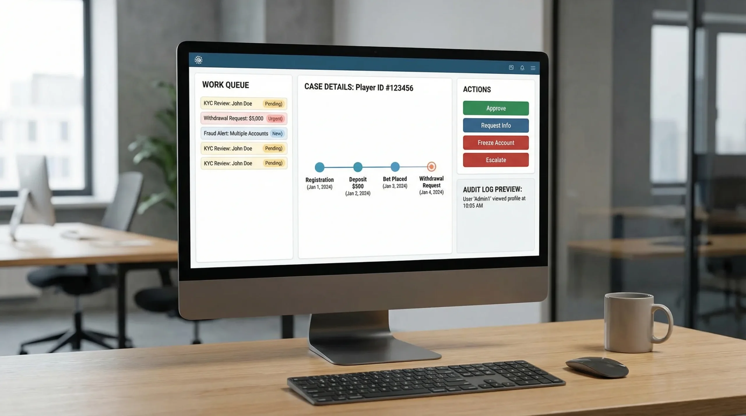
Work queues that behave like a control room
A queue is not a list. It is a decision interface. Strong queues provide:
- Clear prioritization (risk, value, SLA breach, aging)
- Bulk actions (where safe)
- Smart filters that persist
- One-click “open next” for flow state
A key detail: queues should support exception handling. “I cannot decide because X is missing” should be a first-class state, not a note.
A single “source of truth” timeline per player (and per wallet)
Ops teams waste time when the truth is spread across modules. Build (or demand) a unified timeline that can render:
- Identity events (KYC attempts, outcomes, vendor responses)
- Payment events (initiated, authorized, settled, reversed)
- Wallet/ledger events (credits, debits, holds, adjustments)
- Gameplay context (sessions, wager spikes, bonus use)
- Support context (tickets, chat transcripts, internal notes)
Even if the underlying architecture is modular, the UX must feel like one system.
“Case management” for compliance, risk, and payments
Casino ops is full of multi-step investigations. Treat them like cases, not scattered actions.
A case object should include:
- Scope (player, transaction, campaign, affiliate)
- Current status (open, pending info, escalated, closed)
- Owner and SLA
- Evidence attachments
- Decision summary (structured + free text)
This is the difference between an operation that scales and one that relies on tribal knowledge.
Action design for high-stakes operations
In a casino backoffice, the same button can be worth thousands of dollars (or trigger a regulatory incident). Design actions with:
- Previewable impact (what happens to balances, bonus states, and eligibility)
- Explicit side effects (notifications sent, funds held, account flagged)
- Reversibility rules (can you undo? if not, what is the recovery play?)
| Action type | Risk | UX pattern that works | What to log |
|---|---|---|---|
| Approve payout | High (money + compliance) | Preconditions checklist + maker-checker for thresholds | Who approved, evidence viewed, rules satisfied, timestamps |
| Manual balance adjustment | Very high | Require reason code + attach evidence + limited permissions | Delta, currency, linked case, approver |
| Freeze account | Medium to high | One-click containment + required comment | Trigger source, scope, duration, reviewer |
| Bonus void / confiscation | Medium (player disputes) | Show term violated + impacted amounts | Rule, event evidence, comms sent |
Embedded analytics that answers “what should I do next?”
Backoffice analytics should not live only in a separate dashboard. Ops needs contextual metrics inside workflows:
- On a withdrawal review: past payout times, chargeback history, linked accounts, device changes
- On a bonus abuse case: wagering pattern flags, game contribution anomalies, multi-account signals
- On an affiliate payout: cohort quality metrics, dispute rates, KYB status
This is where real-time visibility becomes operational, not just reporting.
(Spinlab’s platform includes a real-time analytics dashboard and integrated fraud prevention and compliance modules; when evaluating platforms, ask to see how those insights appear inside day-to-day admin workflows, not only in a high-level BI view.)
The most common backoffice UX anti-patterns (and what to do instead)
Anti-pattern: “Everything is a table”
Tables are necessary, but they are not sufficient. Analysts need structure: highlights, anomalies, and a narrative view.
Fix: Keep tables for scanning, but add a case summary card at the top: why it is in the queue, what is unusual, what action is recommended, and what evidence is missing.
Anti-pattern: Hidden system states
Async payments, crypto confirmations, and third-party KYC responses produce edge cases. If your UI collapses them into generic failures, ops becomes guesswork.
Fix: Model states explicitly (initiated, pending, delayed, needs action, failed, reversed) and show a timeline.
Anti-pattern: Permissions that are either too open or too restrictive
Over-permission creates fraud and compliance risk. Under-permission forces Slack approvals and screenshots.
Fix: Implement role-based access + scoped privileges (by brand, geo, currency, action type) and use maker-checker where risk warrants it.
Anti-pattern: Notes that are unsearchable and unactionable
Free-text notes without structure become a compliance liability.
Fix: Combine structured fields (reason codes, tags, linked entities) with narrative notes, then make both searchable.
Security and compliance are part of UX (especially in 2026)
Backoffice UX must assume:
- Internal misuse risk (insider threat)
- Credential compromise (phishing, reused passwords)
- Regulatory expectations for evidence, retention, and access controls
A few practical expectations to bake into admin design:
- Strong authentication and session controls (SSO where possible, short-lived sessions for privileged actions)
- Visible audit logs and immutable event trails
- Data minimization (show only what a role needs)
- Consistent evidence export for disputes and audits
For general web app security baselines, OWASP’s Top 10 is a reasonable reference point. For usability and accessibility, align admin UIs with WCAG where feasible; internal tools still benefit from clearer contrast, keyboard navigation, and predictable focus states.
Measure backoffice UX like you measure conversion
If you do not quantify operational UX, it will be perpetually “important” and perpetually deprioritized.
Track metrics that map directly to throughput, correctness, and player impact.
| Backoffice UX metric | What it indicates | Why it matters |
|---|---|---|
| Median and P95 time-to-decision (by queue) | Efficiency and bottlenecks | Backlogs create churn, ticket volume, and fraud leakage |
| Rework rate (actions reversed or corrected) | UX clarity and training gaps | Rework is hidden cost and often a compliance risk |
| “Missing info” deferral rate | Upstream data quality + UI completeness | High rates point to better data capture or better context |
| Manual review rate (per flow) | Automation effectiveness | Manual reviews do not scale without better UX |
| SLA breach rate | Operational health | Breaches are where regulators and VIPs notice |
| Ops NPS (internal) | Usability and trust | If ops does not trust the panel, they will bypass it |
A practical cadence is a weekly ops review that looks at queue volumes, aging, and top failure reasons, then turns one root cause into a two-week UX fix.
A demo script to evaluate casino backoffice UX (use this with any vendor)
Do not ask vendors to “show the backoffice.” Give them realistic tasks and watch whether the UI supports fast, correct outcomes.
Here are high-signal tasks:
- Review a withdrawal that is pending due to KYC, then resolve it without leaving the flow
- Investigate two accounts that look linked (shared device/payment) and document the decision
- Create a bonus with eligibility rules, preview its cost mechanics, and show how abuse is flagged
- Export an audit evidence pack for a chargeback or dispute (identity, authentication, ledger, terms acceptance)
- Handle a payment provider degradation event (how does the UI surface incidents and route work?)
What you are testing is not only features. You are testing:
- Information architecture (can they find what matters quickly?)
- State modeling (are edge cases handled clearly?)
- Action safety (are there guardrails and meaningful logs?)
- Consistency (do patterns repeat across modules, or is it a patchwork?)
Where Spinlab fits (if you are selecting or replacing a platform)
Spinlab positions itself as an all-in-one, modular iGaming platform for launching and scaling online casinos, with integrated payments (crypto and fiat), game aggregation, real-time analytics, fraud prevention, and KYC/AML compliance. For backoffice UX specifically, look for:
- A customizable backoffice admin panel that matches how your team works
- Operational visibility via real-time analytics that is usable during live incidents
- Integrated controls for payments, compliance, bonuses, and affiliates so ops is not stitching five tools together
- An interface that delivers a “Shopify-like” experience (fast onboarding, low friction admin)
If your operation is feeling the pain of fragmented panels, slow reviews, or scaling bottlenecks, start with a backoffice UX audit and a task-based demo. You can explore Spinlab’s platform at spinlab.studio and validate whether the admin experience fits your workflows before you commit.