
First impressions are painted, not written
Open an online casino for the very first time. Before a single slot game loads or a welcome bonus pops up, your brain has already taken a snapshot of the interface color scheme and decided—within 90 seconds—whether the site looks trustworthy, exciting, or forgettable. According to a frequently cited University of Winnipeg meta-analysis, up to 90 % of this initial judgement is driven solely by color.
For iGaming operators, these milliseconds translate directly into conversion and retention metrics. A button shade that feels ‘safer’ can lift first-time deposit rates, while poorly contrasted tables in live casino lobbies may nudge VIP players to churn. In a marketplace where dozens of white label brands share the same game catalog, strategic color design becomes a competitive weapon.
This article unpacks the psychology, cultural nuances, and data science behind casino color palettes, then offers practical guidelines for teams building on a modern iGaming platform such as Spinlab’s Fullhouse.
1. Why color holds disproportionate power in iGaming UX
- Emotion priming: Gambling is inherently emotional. Colors act as instant primers—red spikes arousal; green calms and signals prosperity; gold whispers luxury.
- Trust & safety cues: Digital money requires reassurance. Cool hues (blue, teal) are repeatedly shown to raise perceived security and reduce checkout friction.
- Attention steering: With hundreds of slot thumbnails vying for clicks, high-contrast accent colors guide the eye to promotions or new pragmatic slots without overwhelming the lobby.
- Accessibility compliance: Up to 1 in 12 men have some form of color-vision deficiency. Color-aware design reduces accidental misclicks that could trigger bonus abuse flags and impact your risk engine.
2. Color psychology cheat-sheet for casino products
| Color | Core emotions | Best UI use cases | Caveats |
|---|---|---|---|
| Red | Excitement, urgency, passion | Spin buttons, countdown timers, flash bonuses | Overuse can raise perceived risk; avoid on cashier pages |
| Blue | Trust, stability, security | Login forms, KYC screens, payment gateway widgets | Too much may feel corporate, lowering fun factor |
| Green | Growth, luck, wealth | Deposit confirmation, jackpot meters, live roulette table bets | In some cultures (e.g., Indonesia) green may carry religious undertones |
| Gold | Prestige, VIP exclusivity | Loyalty tiers, high-roller tables, rare loot boxes | Needs sufficient contrast on dark backgrounds |
| Purple | Mystery, creativity | Seasonal events, NFT loot reveals, crypto onramp banners | Can read as childish if combined with pastel palettes |
| Black / Charcoal | Sophistication, power | Backgrounds for high-stakes rooms, dark mode | Low contrast with grey text fails WCAG AA |
Quick win
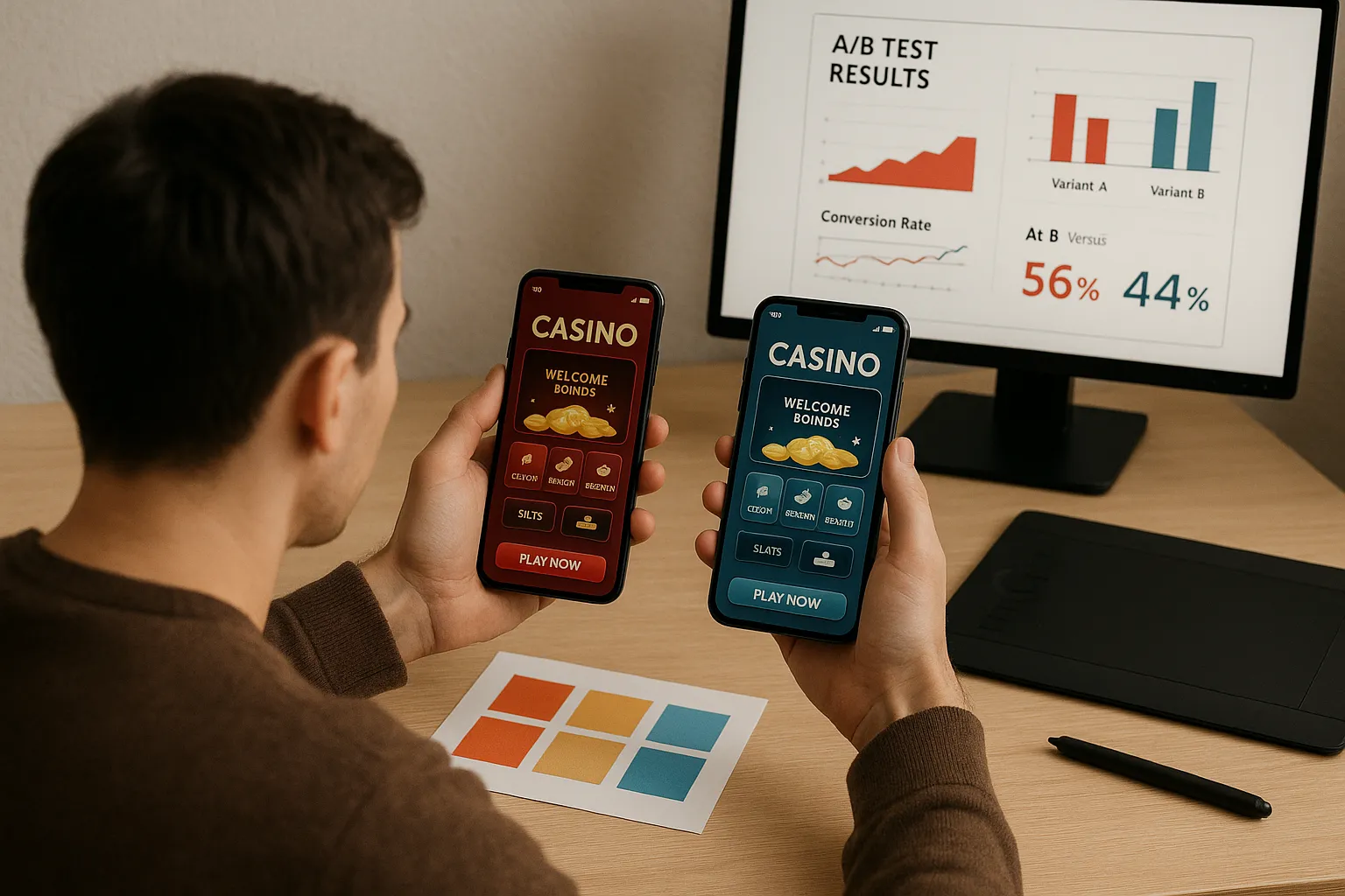
Try switching your “Claim Bonus” button from generic green to a saturated magenta accent. In an A/B test run by a mid-tier EU sportsbook (internal Spinlab dataset, Q1 2025), the variant lifted mobile CTR by 7.8 % without increasing mis-taps.
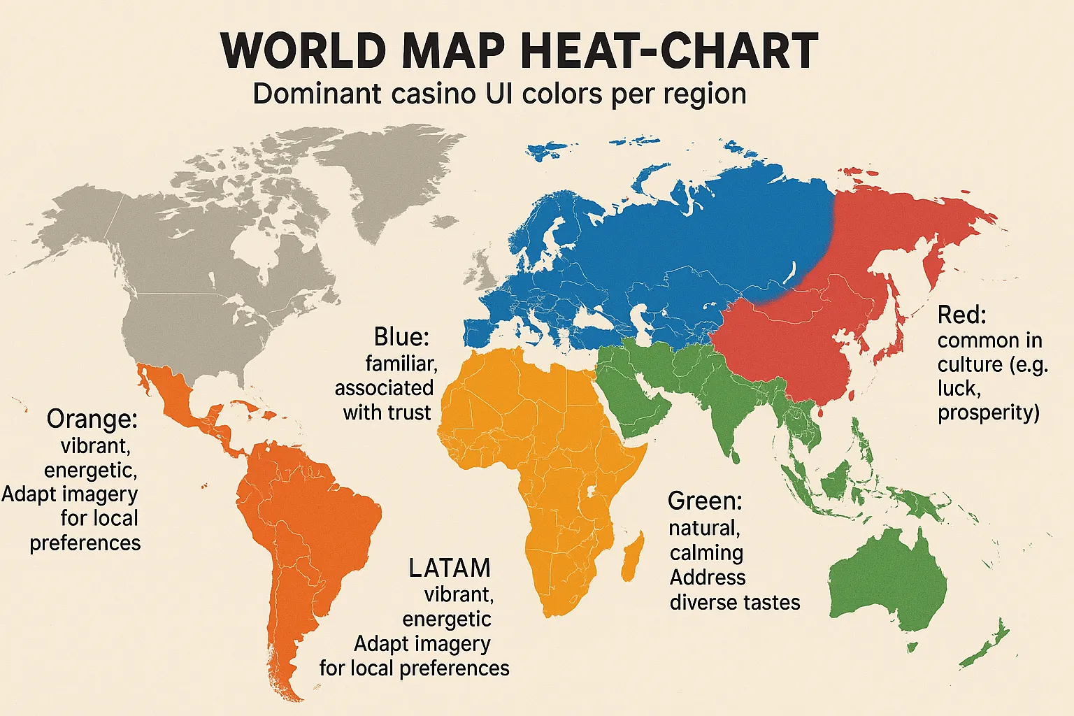
3. One palette doesn’t fit all: cultural and regional nuances
Color associations vary dramatically across target markets:
- LATAM: Warm oranges and yellows evoke festivity and are effective for tournament banners.
- Nordics: Muted blues and whites speak to transparency—critical in highly regulated Sweden and Finland.
- East Asia: Red symbolizes luck and prosperity; however, white is linked to mourning in China and should be avoided on celebration pop-ups.
- Middle East: Green carries religious significance; brands often tone it down to teal to maintain neutrality.
Tip: Pair your market launch checklist with a palette audit. Spinlab’s backoffice theme manager lets operators clone a base theme, swap tokenized color variables, and preview localized versions in under five minutes.
4. Data beats taste: how to test colors scientifically
Relying on HiPPO (Highest paid person’s opinion) color choices is a common pitfall. Instead, adopt a measurement framework:
- Define a single metric: e.g., ‘deposit-to-registration conversion’.
- Select one color variable: background of the cashier header or hue of the primary CTA.
- Split traffic 50/50 on identical cohorts (geo, device, acquisition channel).
- Run for at least one volatility period: 7-14 days covers weekend spikes.
- Analyze with Bayesian inference to avoid the peeking problem.
Because Spinlab logs events into a real-time analytics pipeline (see our deep dive), you can view lift percentages minutes after hitting statistical power.
Case snippet: Fullhouse dark-mode rollout
When Fullhouse Casino migrated to Spinlab in 2024, they A/B tested a pure black (#000) lobby against a charcoal (#141414) variant. Despite near-identical aesthetics, the darker version suppressed slot RTP overlays—critical information for high-rollers. The test showed a 4 % drop in average bet size among VIP tier 3 players, leading the team to standardize on charcoal and increase overlay brightness by 15 %.
5. Responsible gambling & compliance signals
Regulators are paying closer attention to visual nudges that may encourage impulsive play. Incorporate the following safeguards:
- Highlight withdrawal, self-exclusion, and loss-limit buttons with calm colors (e.g., desaturated blue) that contrast promotional reds.
- Use green checkmarks for completed KYC steps to reinforce progress.
- Avoid flashing neon animations on risk disclaimer tooltips.
The UK Gambling Commission has flagged aggressive red/black contrasts on auto-spin settings as “dark patterns.” Staying color-compliant is cheaper than refactoring under an enforcement deadline.
6. Implementation best practices on a modular iGaming platform
- Tokenize your palette: Define semantic tokens (
--color-cta,--color-win,--color-loss) rather than hardcoding hex values. Spinlab’s open API exposes these tokens to theme microservices. - Support dark & light modes: iOS 18 and Android 15 auto-prompt users; failing to provide a dark theme can reduce session length by up to 12 % on OLED devices.
- Leverage dynamic theming: Tie jackpot meter colors to real-time thresholds. When a progressive slot crosses 90 % of historical max, auto-switch the meter background to pulsing gold.
- Cache for performance: Serve critical CSS inline and lazy-load theme variants. Colors that appear during first contentful paint impact perceived speed.
- Document: Include a color usage guide in your backoffice wiki so marketing teams don’t override safety cues in flash promos.
7. Emerging trends to watch
- Adaptive palettes via AI: Real-time machine vision can detect ambient light through webcams (with consent) and adjust lobby brightness, reducing eye strain during night sessions.
- WebGPU-driven gradients: Subtle motion gradients that respond to win events create novelty without sacrificing load times.
- haptic color cues on mobile: Vibrancy-mapped haptics (e.g., sharper pulse with reds) are being tested by several US operators.
- Eco-theming: Carbon-aware design darkens the UI during peak grid hours to save battery and server energy.
8. Putting theory into practice
Color may feel subjective, yet its impact on user behavior is quantifiable. By combining psychological principles, regional insights, and data-driven experimentation, casino brands can fine-tune every hue for maximum player value—and do so quickly with a flexible white label casino platform.
Whether you are re-skinning an established brand or launching a crypto-ready newcomer, treat color tokens like any other revenue lever. Prototype, test, and iterate until your palette doesn’t just look good—it earns.
Ready to build an on-brand casino UI without touching a single line of CSS? Explore how Spinlab’s modular theme engine slots into a full turnkey casino solution at https://spinlab.studio.