
Crypto deposits rarely fail because players “don’t want crypto.” They fail because the onramp UX feels like a separate product: different terminology, unclear fees, unfamiliar steps, and too many moments where the player is forced to make a technical decision (chain, wallet, confirmations, memos) under time pressure.
If you want to boost crypto deposits, treat the onramp like your highest-leverage conversion funnel. The goal is simple: get a new or returning player from intent (“I want to deposit”) to playable balance with minimum uncertainty.
Below are field-tested onramp UX tactics for iGaming operators, product teams, and growth leads who want more funded accounts, higher deposit completion, and fewer “where is my crypto?” support tickets.
Start by mapping the two crypto deposit journeys (they have different friction)
Most casinos blend these into one “Crypto” button, but the UX problems differ.
Journey A: “I already have crypto” (wallet-to-casino)
Typical failure modes:
- Wrong network selected
- Wrong asset sent
- Missing memo/tag
- Confusion about confirmations, fees, or minimum deposit
- Player sends, then abandons because there’s no feedback loop
Journey B: “I need to buy crypto” (fiat-to-crypto onramp)
Typical failure modes:
- Extra KYC at the worst moment
- Price/fee ambiguity (spread, processing, network fee)
- Drop-off during bank/card authorization
- No clear “time to playable balance” promise
UX implication: you will convert more deposits if you explicitly split these two intents and optimize each.
The highest-impact onramp UX tactics (in priority order)
1) Offer two clear entry CTAs: “Buy crypto instantly” vs “Send crypto from wallet”
This is the fastest way to reduce cognitive load.
Good patterns:
- Two large tiles with plain-language subtitles
- Show which option is faster for that user (based on geo, device, and past behavior)
Avoid:
- A single “Crypto deposit” flow that immediately asks the player to choose chains and tokens
2) Default to one “safe” asset and one “safe” network, then reveal alternatives
Players interpret choice overload as risk.
A practical approach:
- Default to a stablecoin route when possible (stable value reduces “did I lose money?” anxiety)
- Default to the network you most reliably credit and support
- Let advanced users change token/network behind an “Other options” link
This is not about limiting choice forever. It’s about not making the player think before they’ve succeeded once.
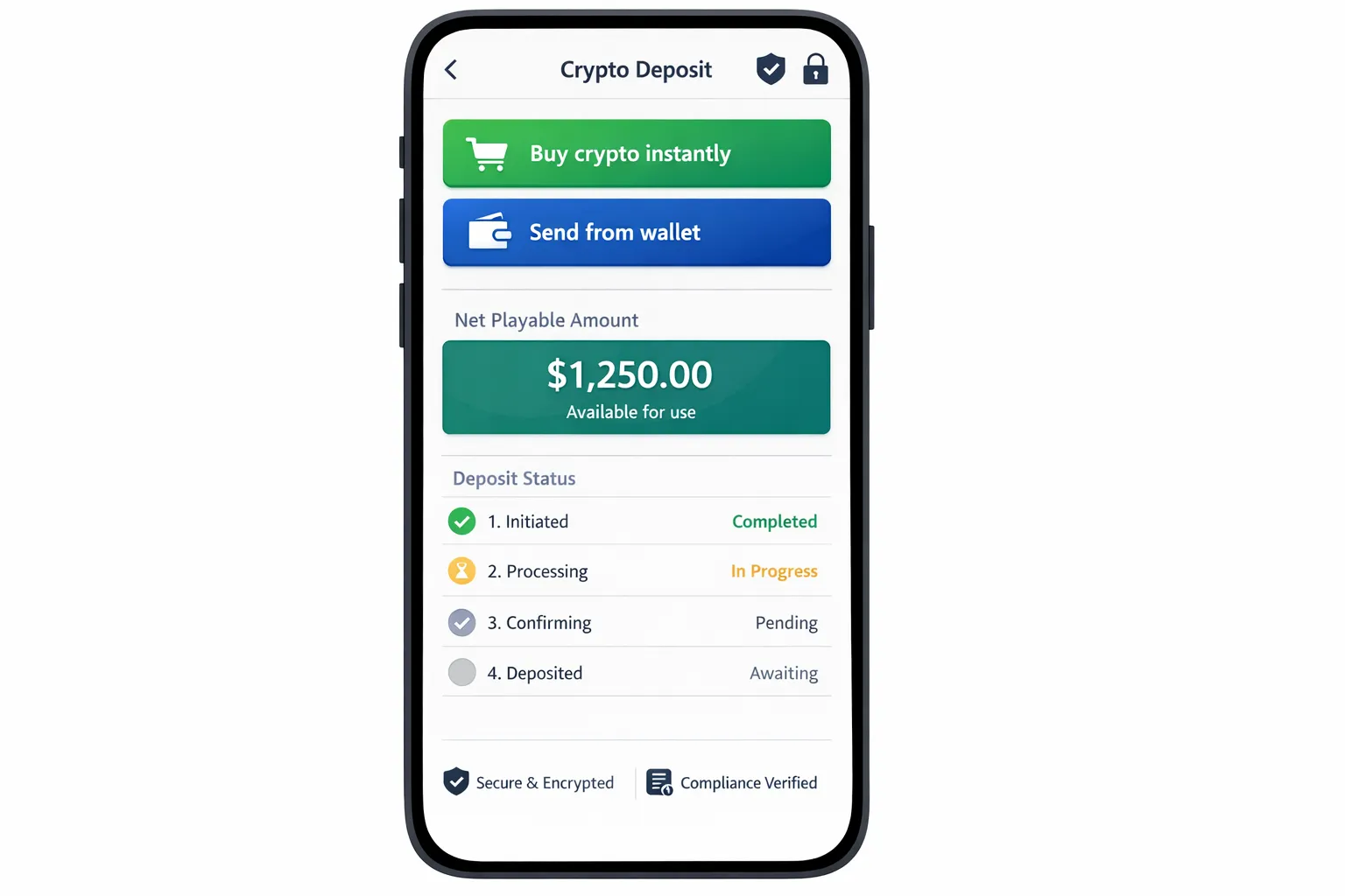
3) Show “Net playable amount” (not just “Deposit amount”)
Crypto deposit UIs often show:
- Deposit amount
- Network fee (maybe)
But players actually decide based on what they can use immediately.
A better summary block:
- You pay: $X (or local currency)
- Fees included: $Y (with tooltip)
- You receive playable balance: $Z
- Estimated time: “Typically under N minutes”
If you need deeper guidance on fee transparency patterns, link it internally in your cashier UI spec. Spinlab has a dedicated guide on this topic: Designing a Crypto Cashier That Explains Gas Fees Clearly.
4) Make “time to playable balance” a first-class UX promise
Players tolerate fees more than uncertainty.
Practical implementations:
- Put an ETA next to each method (wallet transfer vs buy)
- During confirmation waiting, show a progress state like “1/12 confirmations” (or equivalent), plus an honest estimate
If your product team is already optimizing for fast checkout, align this with your broader cashier work. See: Cashier Conversion Hacks: Optimizing Deposit Forms for 3-Second Checkout.
5) Use device-native affordances: QR, copy, and deep links (all three)
Your players are on mobile. Crypto depositing on mobile should not require app switching gymnastics.
Include:
- A QR code for the deposit address
- A one-tap copy button with a “Copied” confirmation
- A wallet deep link where supported (so “Open in wallet” actually opens the right app)
Also add:
- A “Share address” action (uses OS share sheet)
- A “Paste transaction hash” field for troubleshooting
6) Prevent network mistakes before they happen (pre-flight checks)
The biggest crypto deposit support driver is “I sent on the wrong network.” You cannot fix every mistake, but you can prevent many.
Strong prevention patterns:
- Show the network name in plain language, not just ticker-like abbreviations
- Add a “Network must match” warning next to the address and QR
- If the wallet connection supports it, detect the selected network and warn on mismatch
7) Handle memos/tags with aggressive clarity
For networks/assets that require a memo/tag, your UI should treat it as mandatory, not optional.
Good patterns:
- Display address and memo as a single “two-part” deposit instruction
- Provide separate copy buttons for address and memo
- Add a “Missing memo can result in lost funds” warning that is hard to miss
8) Add a real deposit status tracker with a support-grade audit trail
After the player sends, the UX should not dead-end.
A high-converting deposit tracker:
- Shows deposit detected vs pending confirmations vs credited
- Lets the user paste a transaction hash if you haven’t detected it yet
- Links out to a relevant block explorer (one link, not ten)
- Provides an easy “Contact support” entry with context attached
This reduces abandonment and lowers support time because the player can self-serve basic visibility.
9) Don’t force full KYC at the moment of highest excitement, use risk-based gating
Regulatory requirements vary, and you should follow your license obligations. But UX-wise, the principle is consistent: do not surprise the player with a long identity flow after they’ve chosen an amount.
Better patterns:
- Pre-announce KYC before the player starts (“Identity verification may be required to deposit or withdraw”)
- Use progressive disclosure (“Takes about 2 minutes, you’ll need an ID”)
- If your compliance model allows it, apply risk-based checks so low-risk users experience less friction
For practical KYC UX improvements that reduce drop-off without weakening compliance, see: 11 UX Tweaks That Cut KYC Drop-Off by 30%.
10) Make compliance data entry feel lighter (especially for Travel Rule scenarios)
If you operate in jurisdictions affected by the Travel Rule and related crypto transfer requirements, design the data capture so it feels contextual and minimal.
UX tactics that reduce rage:
- Only ask for additional counterparty fields when they are actually required
- Explain why you need it in one sentence (“Required for regulated crypto transfers”)
- Save progress and allow retry without re-entering everything
Spinlab has deep compliance-focused implementation guidance here:
11) Reduce first-deposit decision friction with smart presets and “most popular” anchors
Crypto deposit amounts are often higher variance than card deposits. That’s good for revenue, but it increases anxiety.
High-performing patterns:
- 3 to 5 amount presets in local currency
- Label one preset “Most popular” (based on your actual data)
- Show any minimum deposit clearly next to the amount field
12) Put trust cues where the doubt happens (at the address, not in the footer)
“Is this safe?” happens when the player sees a long string address or a third-party onramp step.
Trust cues that help at the point of action:
- Security and custody explanation in one line (especially important if you use merchant custodial wallets)
- Short compliance note (KYC/AML, jurisdictional restrictions)
- A clear support path (“Deposit issue? Track your transaction”)
13) Design for failure and retries (because crypto is adversarial to perfect UX)
Even with a great onramp, failures happen: wallet rejection, bank decline, stuck pending states, partial fills.
Your error states should:
- Say what happened in plain language
- Say what the user can do next
- Preserve entered values
- Avoid scary blamey wording (“invalid”) when it’s really “we couldn’t confirm yet”
14) Use post-deposit momentum: route players directly into play (and measure it)
A subtle but real leak: the deposit completes, then the player lands back in a generic lobby and loses momentum.
Better:
- “Deposit successful” confirmation plus a single primary CTA: “Start playing”
- Optionally deep-link into the last viewed game or most popular category
- If you use bonuses, show the bonus status clearly (activated vs available)
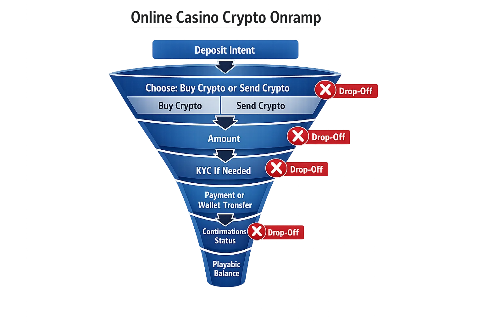
A practical KPI model for crypto onramp UX (what to track)
If you can’t measure the exact step where players drop, you’ll keep arguing opinions.
Track crypto deposits like a product funnel, not like accounting.
| Funnel stage | What it means | Example metric | Common drop-off cause |
|---|---|---|---|
| Deposit intent | Player opens cashier | Cashier open rate | Confusing CTA placement |
| Method selection | Player chooses buy vs send | Method select completion | Choice overload |
| Amount set | Player confirms amount | Amount submit rate | Minimums, unclear fees |
| Compliance gate | Player completes KYC/required checks | KYC completion rate | Surprise KYC, poor mobile capture |
| Payment initiated | Wallet signed or fiat payment authorized | Initiation rate | Wallet friction, bank declines |
| Deposit credited | Funds become playable | Credit rate | Network mismatch, pending confirmations |
| Time to playable | Seconds/minutes to usable balance | Median time to playable | Slow rails, unclear status UX |
Spinlab-style real-time analytics (or any equivalent event-driven setup) matters here because cashier performance is operational, not monthly reporting. You want to see failures as they happen, segmented by geo, device, and method.
The fastest A/B tests that usually move crypto deposit conversion
You don’t need 30 experiments. Start with the few that change player certainty.
Good first tests:
- Two-entry split vs single crypto flow (buy vs send)
- Default stable asset vs default volatile asset
- Net playable amount shown upfront vs fees shown later
- Deposit tracker UI vs static “pending” message
- Wallet deep link present vs absent (mobile only)
If you already run lifecycle automation, connect cashier abandonment to triggered recovery flows. Spinlab has a solid operator playbook here: Turning Abandoned Deposit Attempts Into Triggered Email Revenue.
Implementation notes for platform teams (how to make UX improvements shippable)
The best onramp UX is usually blocked by “we can’t change the cashier quickly.”
Design your cashier as modules:
- Payment method selection
- Amount and fee quote
- Compliance checks (KYC/AML)
- Transfer instructions (address, memo, QR, deep links)
- Deposit status tracking
If your platform supports modular components, open APIs, and configurable backoffice controls, these tactics become small iterations instead of multi-week rewrites.
Spinlab Studio positions its product as a modular, crypto-ready white label casino platform, including crypto onramp support, integrated payments, KYC/AML, fraud prevention, and real-time analytics. If you want to pressure-test your current onramp flow and identify the specific screens causing abandonment, you can start with a platform walkthrough at spinlab.studio.